Visual widgets
This section describes visual Panel widgets in HIL SCADA
The main purposes of this group of widgets is to visually enhance HIL SCADA or better organize Panel widgets.
The widgets listed below are available in this group:
- Group widget - is used for grouping other widgets into meaningful groups.
Initially you can add widgets to the Group widget by dragging and dropping them from the
Library Panel. Once added, you can cut/copy/paste the existing
widgets into the Group widget.
Figure 1. Group widget used for grouping other widgets 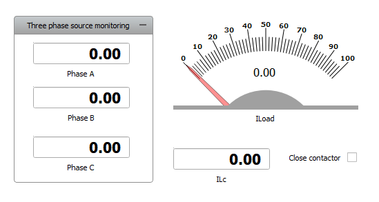
- Sub-Panel – is very similar to a Group widget and is used for grouping other
widgets into hierarchically organized sub-panels. To enter the Sub-Panel double-click it
or select the Open Sub-Panel option from the context menu. You can
copy/cut any widget into the Sub-Panel which is opened or even add another Sub-Panel in
order to create a hierarchically organized HIL SCADA configuration.
The Sub-Panel widget can work in two modes, which can be changed by choosing the desired mode in the context menu, accessed by right-clicking on the Sub-Panel widget (Figure 2).
Figure 2. Choose working mode 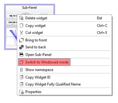
The Sub-Panel has two supported working modes:
- Default Embedded mode, where the Sub-Panel is opened in the main Panel tab;
- Windowed mode, where the Sub-Panel is opened in an External Window (Figure 3).
Figure 3. Sub-Panel working in Windowed mode 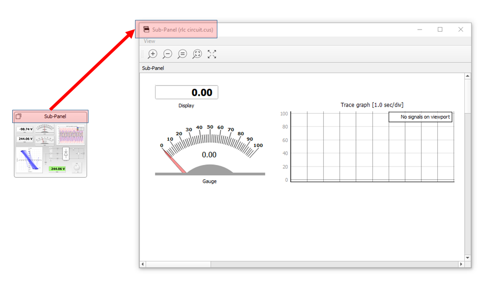 Note: The position, size, and state of the External Window is saved in an opened Panel (*.cus) file and restored after the Panel file is loaded.
 - Text Note – is used for putting short text notes on the canvas.
- Image - is used for inserting an image into the canvas. Each image can be set as a background. In this mode, an image cannot be selected or moved and it will be positioned below all widgets on the canvas.