Panel Tabs
This section describes panel tabs
The central part of HIL SCADA is occupied by Panel tabs. Each Panel is located in a separate tab and a widget can be drag and dropped from the Library Explorer dock to the selected Panel or copied between opened Panels.
When you switch between opened Panels, History Dock and Panel Explorer will be changed to follow the currently selected Panel.
Each Panel consists of two main parts:
- Control bar at the top of Panel
- Panel canvas in the middle of Panel
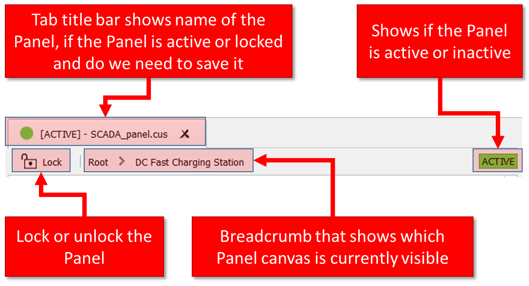
Control bar contains indicators which show whether Panel is locked or unlocked, whether Panel is active or inactive, if you need to save Panel, and it also contains simple breadcrumb-like navigation that shows the currently visible canvas (in case you have opened the Sub-Panel widget).
 when the simulation is running and one Panel needs to be
opened and activated before you start the simulation. To activate a Panel, click the
when the simulation is running and one Panel needs to be
opened and activated before you start the simulation. To activate a Panel, click the  button or right click the Panel tab and choose Set Active.
Panel canvas is the central part of each Panel and it allows you to create your own, custom interface for the real time model by adding various widgets and arranging them freely on the canvas.
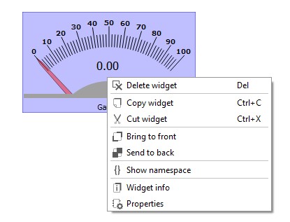
To place a widget on the Panel canvas, select the desired widget from the Library Explorer dock and then drag-and-drop it to the canvas (Figure 2).
All other interactions with the widgets that have already been placed on the canvas (resizing, moving, selecting...) are done by left-clicking. Right-clicking either the canvas or the widget invokes a context menu, giving you access to the available actions, as shown in Figure 2.
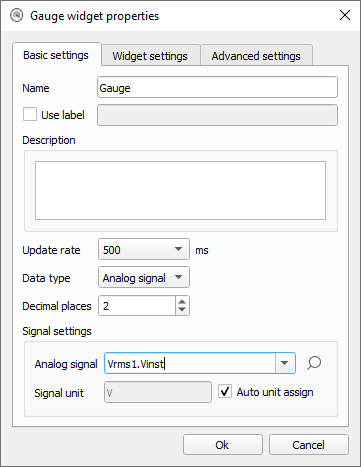
Each widget has a properties dialog where you can configure all standard parameters and widget-specific parameters (Figure 3).
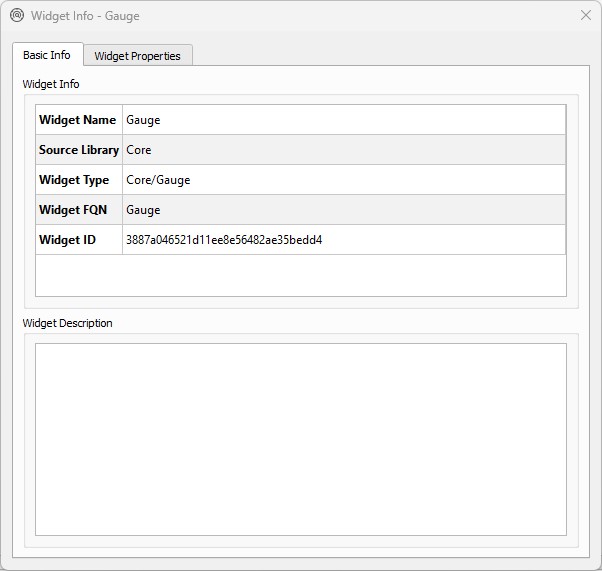
Also, for each widgetWidget Info dialog is available (Figure 4). It shows basic widget information alongside all the available widget properties that can be changed through the HIL SCADA API.