Lookup Table Visualization Tool
Description of the Lookup Table Visualization Tool which is used for visualizing nonlinear characteristics of models in Typhoon HIL Control Center.
The main purpose of this tool is to visualize nonlinear characteristics of certain components described by the lookup tables. It is currently used in nonlinear machines, converters with included power losses, and battery models. The tool is accessible via a "Visualize Lookup Tables" button in the Component properties dialog.
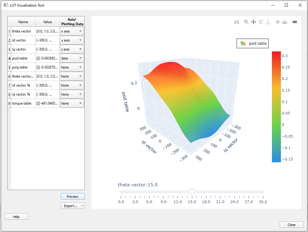
There are two main parts of the Lookup Table Visualization Tool interface - a panel with a table containing data for visualization and a chart area reserved for displaying the plot.
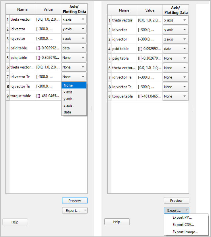
The table consists of three columns. The first column contains vectors and tables names while the second column refers to their values. These names and values correspond to appropriate property labels and values set in the observed component's properties. In the third column, named Axis/Plotting data, you can assign axes to desired vectors and choose the data for plotting. There are three possible axes - x axis, y axis, and z axis. These axes should be selected in accordance with the chosen data dimensionality. 1D, 2D, or 3D lookup tables can be plotted. Possible cases are as follows:
1. 1D lookup table: Plotting data dimension is 1 and
2. 2D lookup table: Plotting data dimension is 2 and
3. 3D lookup table: Plotting data dimension is 3 and
If the axes and data are selected properly and all dimensions match, data is plotted upon clicking the "Preview" button. Only one dataset can be plotted at a time. All other values (vectors and tables) should have Axis/Plotting data set to None.
- CSV - Exports file in CSV format so that each of the selected vectors and data corresponds to one column in spreadsheet applications, such as Excel or Google Sheets
- PY - Exports each of the selected vectors and data in the format of a Python list to a single Python file
- Image - Exports plot as an image in PNG format
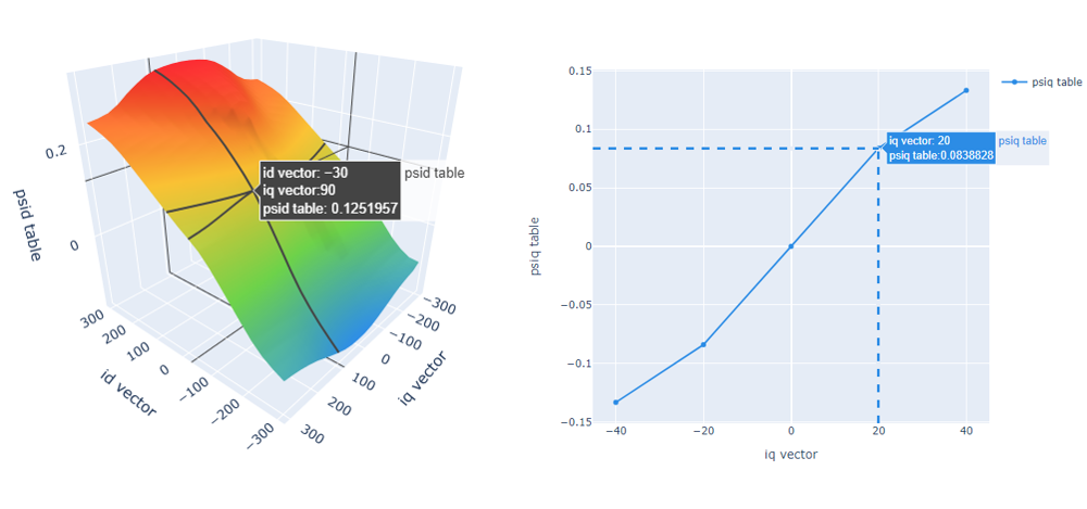
The chart area is the area where the data are plotted. The visualization is performed using the Plotly graphing library and takes the form of a 2D, 3D, or 3D with slider plot representing 1D, 2D, or 3D lookup table respectively. The 3D plot with slider plots 3D lookup tables by using the x-axis to determine the slider values, while the y-axis, z-axis, and data values are displayed in the 3D plot. By moving the slider, you can observe the 3D lookup table data for different x-axis values; these values are labeled on the slider. Plotly offers additional actions with plotted data for 2D and 3D plots as shown in Table 1. The modebar is placed at the top of the chart area.
| All graphs |
Download plot as a ".png"
|
 |
Downloads the plot as a ".png" to an existing file.
|
| Zoom |
|
Enables Zoom mode. To zoom in on a region of a plot, click and hold your mouse, moving across the region. |
|
| Pan |  |
Enables Pan mode. To pan across regions of a graph, click and hold your mouse to explore the data. |
|
|
Reset camera to default
|
 |
Resets graph to the default position. | |
| Toggle show closest data on hover |  |
Turns on/off showing the closest datapoint when hovering over a point on the plot. |
|
| 2D graphs only | Zoom in / Zoom out | 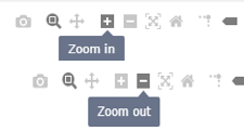 |
Zooms the plot in and out. |
| Autoscale |  |
Zooms the plot back to a setting that is optimized to include all the viewable data. | |
| Toggle Spike Lines |  |
Displays lines on the graph indicating the exact coordinates. To use this feature, click the icon and then hover your mouse over the category of interest to view the toggle spike lines. To turn this feature off, click the icon again. | |
| 3D graphs only | Orbital rotation |  |
Rotates the plot around its middle point in 3D space. |
| Turntable rotation |  |
Rotates the plot around its middle point while constraining one axis slightly.
|