Metrics map
Overview of the Metrics map is a visual representation of the metrics that were collected during testing processes, accessible from the Analyze section of Typhoon Test Hub.
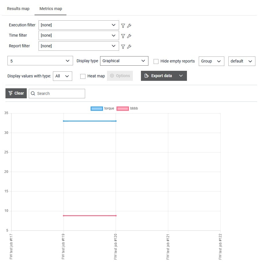
The Metrics map (Figure 1) is a visual representation of the metrics that were collected during testing processes across multiple Jobs. It lets you quickly identify differences between job executions and analyze the overall performance of the system. Metric value can have one of the following types: text, number, boolean, and missing (null) value.
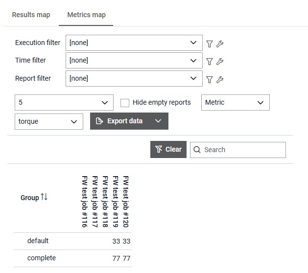
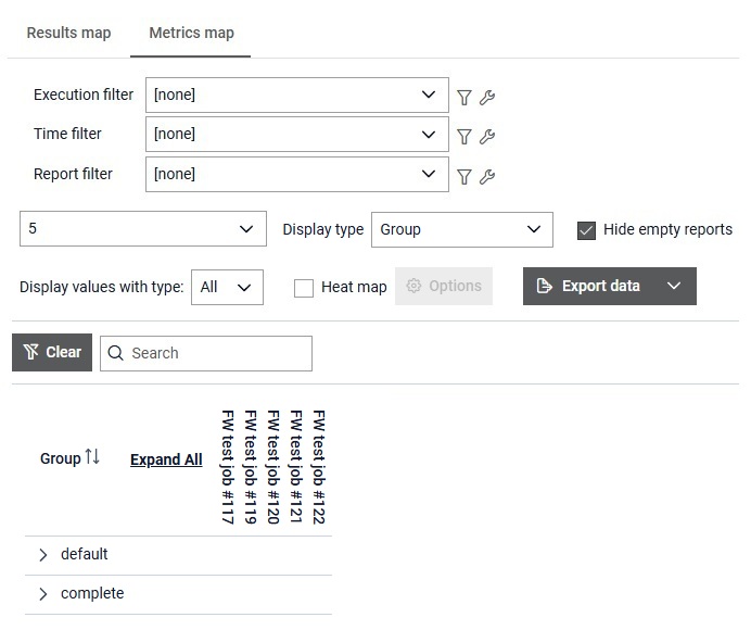
- Number of reports can be inserted.
- Display type is chosen from the dropdown.
- If the checkbox Hide empty reports is checked, then empty reports (reports without any metrics data) will be hidden.
- Data can be grouped by Metric name or by Group name. This choice is disabled for the Group display.
- Depending on the data grouping selection, either metric or group can be selected from the dropdown. This choice is disabled for the Group display.
- Type of metrics data can be selected for showing.
- For the Table display and the Group display, available values are: All, Number, Text, Boolean, Missing value.
- For the graphical display, available values are: Number, Text, Boolean, Missing value.
- Heat map can be enabled which applies coloring to either table or graphical displays.
- Clicking Options button opens dialog for configuring heat map.
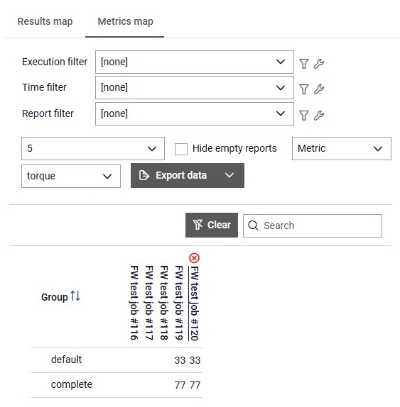
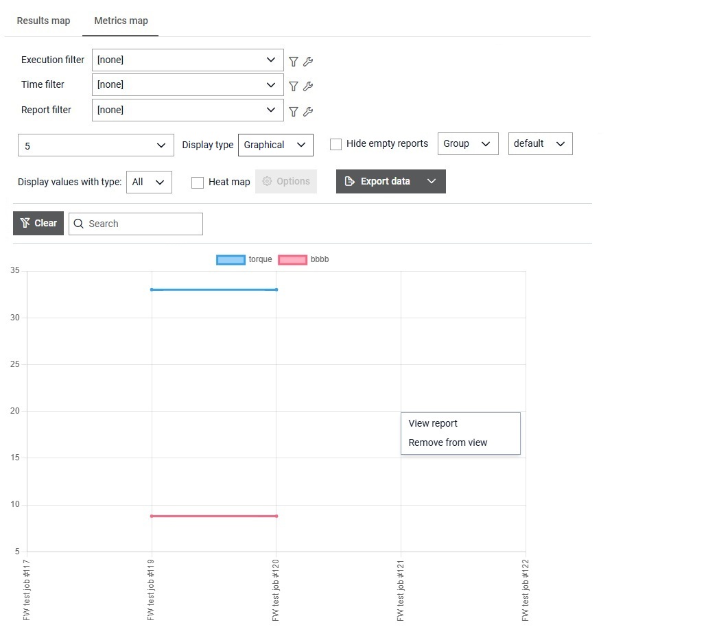
When a report is hovered,  button appears, allowing the user to remove that specific
Report from the metrics map. Once the page is refreshed, the removed Report will be
visible again.
button appears, allowing the user to remove that specific
Report from the metrics map. Once the page is refreshed, the removed Report will be
visible again.
By clicking on the button  data belonging to the filtered reports can be downloaded in
one of the following formats: json, xml and csv.
data belonging to the filtered reports can be downloaded in
one of the following formats: json, xml and csv.
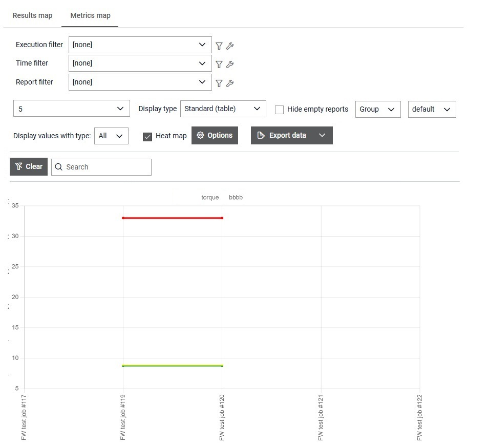
When the Standard (table) display type is chosen, metric values are shown for the selected group or metric. When the Group display type is chosen, metrics are grouped by group name and are shown in a form of a table view.
When the Graphical display is selected, the table view is replaced with the graphical view. The graphical view shows values of certain type inside the line chart. All values are displayed in the same manner in the both displays except for the missing value where all non-missing values are shown on the chart as Not Null while in the table display those values are shown only when all values are shown. Consequently, when heat map for missing values is applied, in the graphical display it is applied only to the chart that shows missing values while in the table display it is applied to all values (missing and non-missing) if some other heat map option for the specific data type is not already applied.
When it is clicked on the chart surface, menu appears which option that can apply to the report that is closes to the position where it was clicked. From the menu, report details page can be viewed in the new tab or the report can be removed from the view.
When Heat map option is checked, heat map is automatically applied to all displays.
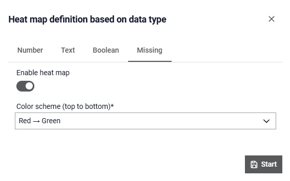
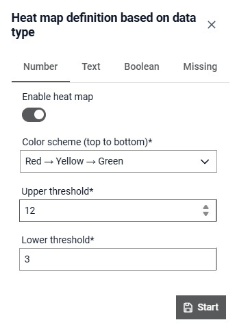
By clicking on the button
 dialog for
configuring heat map option is opened. Depending on the type of data, heat map can be
configured differently. By default, heat map for all types is disabled. By checking
Enable heat map option for specific data type, heat map for that data type is
enabled.
dialog for
configuring heat map option is opened. Depending on the type of data, heat map can be
configured differently. By default, heat map for all types is disabled. By checking
Enable heat map option for specific data type, heat map for that data type is
enabled.
For the number data type, there are three zones: red, yellow and green. You can select color scheme (Red→Yellow→Green or Green→Yellow→Red) where colors are ordered from the top of the chart to the bottom. Additionally, limits between the zone can be defined by specifying upper threshold value (limit between top and middle zone) and bottom threshold value (limit between middle and bottom zone).
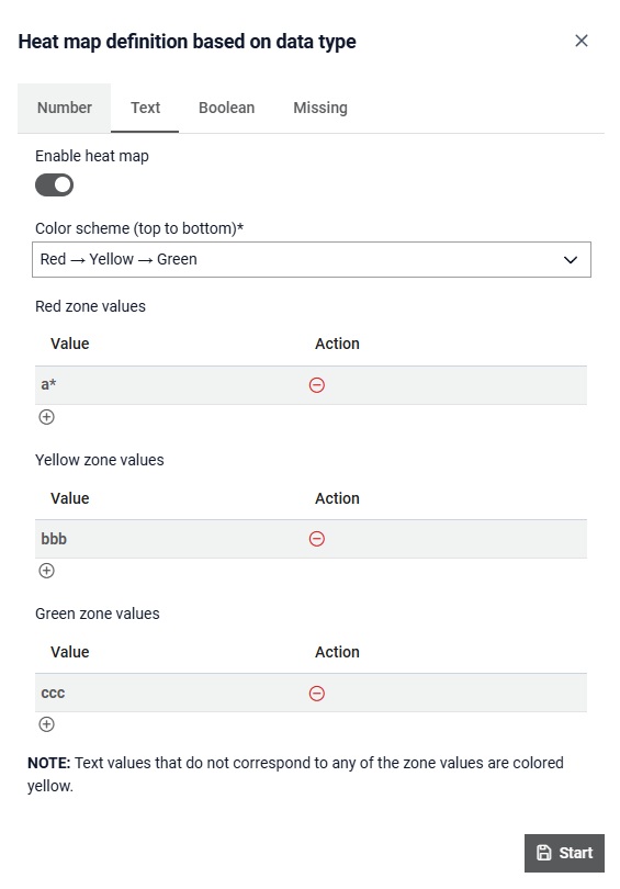
For the text data type, there are three zones: red, yellow and green. You can select color scheme (Red→Yellow→Green or Green→Yellow→Red) where colors are ordered from the top of the chart to the bottom. It is required to define manually for each textual value which zone it belongs to. Wildcard (*) can be used to specify a pattern to match multiple values instead of naming vlaues explicitly. If a textual metric value is recorded and is not specified inside the heat map options or does not match any patterns, it will be assigned to the yellow zone.
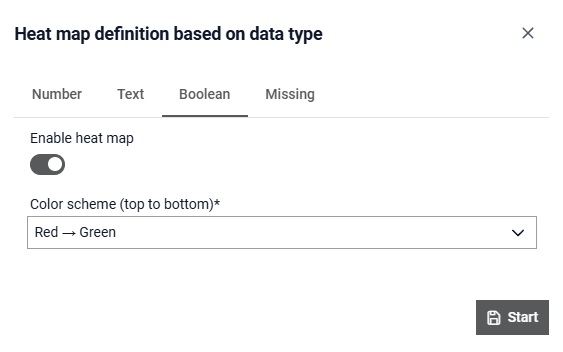
For the boolean data type, there are two zones: red and green. You can select color scheme (Red→Green or Green→Red) where colors are ordered from the top of the chart to the bottom. Positive value (true) is positioned higher on the chart than the negative value (false) because they are treated as 1 and 0 respectively.
For the missing (null) value data type, there are two zones: red and green. You can select color scheme (Red→Green or Green→Red) where colors are ordered from the top of the chart to the bottom. Missing (null) is positioned higher on the chart than the non-missing value because the interest is focused on the value being null.